Every Picture Tells a Story
What’s the toughest crowd I can think of off the top of my head? Teenagers. Sarcastic, disinterested, know-it-all teenagers. To all the parents of teenagers reading this blog, I’m about to do you a favour.
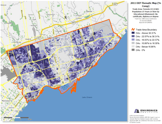
Let’s start by looking at a map of the Toronto census subdivision (CSD). The variable being mapped here is Population 15 Years or Over by Educational Attainment; specifically, the percentage of the population, by dissemination area, with no certificate, diploma or degree.
Programming note: all maps in this article were produced by ENVISION, Environics Analytics’ powerful online micromarketing tool.

This is what’s called a choropleth map; essentially, the darker the area, the higher the concentration of whatever variable is being mapped. In the above map, educational achievement—or rather the lack thereof—appear as the dark purple areas. The darkest areas, representing about one-third of the population, are made up of high school drop-outs.
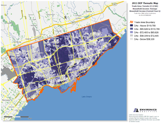
Next, let’s look at the same geography. But this time we’ll map average household income.

For this map, the darker the area, the higher the average income of the households in that neighbourhood.
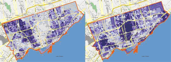
Now, these two maps are pretty impressive on their own, but put the two side-by-side and a more revealing story emerges.

This is my favour to all the parents of teens. Next time little Sally or little Johnny whines about having too much homework, show them these two maps. The relationship is clear as day; simply put, high school drop-outs earn less money—money for iPad apps and ice cream, smartphones and cake pops. A long-winded lecture would never drive the point home quite so quickly or quite as starkly as these two maps.
Personally, one of my favourite parts of being a geographer—and possessing the skillset to create maps in particular—is having the ability to illustrate even the most complex relationships in a format that everyone can understand. Even teenagers.
 As a Research Analyst with the Standard Research team, Melodi Moini helps clients solve their marketing challenges. She has expertise in a number of sectors, including retail, not-for-profits and government agencies, and previously worked as a GIS technician at De Beers Canada Exploration. She holds a bachelor’s degree in geographic analysis from Ryerson University.

